Hello.
I haven't written to you, my dear blog, in quite some time. Lately, I've been feeling the urge to write, even if it's for myself.
Write about what? Honestly, I really don't know. This used to be a blog solely for academic purposes, however, I've decided to repurpose it as a personal soundboard to ground my thoughts in. There are no right or wrong answers. It's merely a place to talk (or mostly rant) to cyberspace about what I'm feeling on the current state of the design culture, and how I fit into it. As someone that deeply hates the sheer amount of obscure blogs there are out there, I guess I'm adding more fuel to the fire. :/
So here we go.
I've been learning a lot about the history and development of the design industry, from arts and crafts to mass mechanization to consumerism. But, where are we now? I feel students are trained to design for profit and consumerism (packaging, posters,and products anyone?) It's not to say that we aren't taught about "sustainability", but using recycled paper and soy inks will not solve the world's problems, thank you very much.
I'm wondering how my skills in visual thinking and writing will help contribute to a better society, one can only design so many non profit fundraiser posters...
But maybe I'm being cynical, or I'm just inexperienced. Is it a crime that I want my profession to have deep meaning, devoid of anything "branding"or "identity" related?
I think my ranting means I need read Nathan Shedroff's "Design is the Problem." Will return with a review and a more optimistic mood, eventually.
Tuesday, May 25, 2010
Monday, November 23, 2009
Nathan Shedroff

Nathan Shedroff is a pioneer in the new face of design. In his world (and rightly so), the worlds of business, sustainability, and design all combine together as industries are now becoming more interdisciplinary. He is the chair of the MBA Design Strategy program at CCA.
Shedroff is also considered an expert in the field of “experience design”, which focuses on the total experience of design (not just visual).
This lecture for me was touching on many levels because I think that a lot of designers do not focus on sustainability, or the process that their designs hurt the natural cycles of earth. It’s safe to say that this approach to design focuses less on the aesthetic 2D designs to a more well rounded approach to design THINKING in general. Shedroff really touches on these theories through his presentation by communicating to us in very simple terms.
Overall, I found his lecture to be refreshing because he spoke to us, not in frivolous academic language, but on a basic level. His powerpoint presentation itself was very clean and easy to read and understand. I had the opportunity to speak with him after the lecture and, even on a personal level, he still reaches the same effective communication.
OBJECTIFIED.
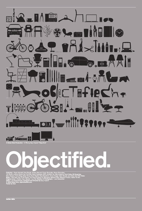
I haven’t seen Helvetica yet, but I was incredibly excited that we got to watch this film. I think industrial design is something that only gets lightly mentioned in most of my classes, so it was refreshing to see the theories and practices of some of the most famous working industrial designers today.
I think the main thing that effected was the whole idea of form and function. The way Hustwit communicated to us about the relationship of form and function was simple and thought provoking: if form follows function in the past, what do we have now? A rounded rectangular shape of the IPhone does not visually yield any idea of what it does, however, it probably replaces about 8 or 9 gadgets. This may sound like a simple idea, but I was blown away. Where is form headed to then, will form and function now be two ambiguous and unrelated things?

Simultaneous Contrast
Simultaneous Contrast is only ONE of the many tools designers use to communicate an idea or solution visually. This method of juxtaposing two complementary colors on the color wheel together at the same time brightens both when placed next to or on top of each other…..see image here.

Why does this happen? It’s quite simple. When we see a color and look away, our brain automatically creates an afterimage of the colors complement in your field of vision. So if you stare at a red dot for 30 seconds and look away, your brain will project a green dot, still with me? Because we already have these natural afterimages, when you already place both complements together, their afterimages are strengthened and brightened, causing a SIMULTANEOUS CONTRAST.
I love using this effect not only in my designs, but also for my makeup designs. Here is a picture of my eyes using shades of bright electric on the lower waterline, and a hot red-orange on the lower lash line. By placing these right next to each other and achieving the right intensity of shade, they both enhance the others shade, adding some extra oomph to my eye color.
PENCIL FACTORY 15 USES FOR NEWSPRINT


In the future, will the newspaper be around? The touch of the paper, the black and white ink, it all screams nostalgia. With more and more becoming digital (surprise, surprise), a group of artists and illustrators decided to use the newspaper PAPER as their medium, and create some amazing and whimsical illustration to purchase at a low cost.
What I like about these, is that they play on the newspaper medium, something that typically holds serious information, and contort it to let the medium speak to them, and become their canvas.
The designs themselves are fictional—they don’t try to portray realism, more of surrealism. A lot of the designs’ aesthetic and color palette hark back to the trends of the 70s, a lot of bright and milky tones of greens, blues, and browns.
I wonder when newspapers will run out of circulation….when they do, I’d love to keep one of these around to hang.
DOLCE AND GABBANA HQ


Architecture can mirror human form. With the explosion of blobitecture and the enhanced use of computer generated curvilinear forms, architecture is becoming more sensual, more human, and more stylized. Take for example, the Dolce and Gabbana headquarters in Milan, Italy. While this building doesn’t possess any major “blob” forms, the overall sleek aesthetic and design mirrors its content—a sexy high fashion Italian fashion company.
The use of black, white, metal, and transparent glass gives the building a signature and modern sleekness. Inside, the white walls represent the clean lines and modern aesthetic seen in many buildings today.
Note the dramatic use of lighting in this building as well. Tall spaced louvers, made of opal glass diffuses daylight to give the building a dramatic but feminine softness. Backlighting of staircases and windows enhances the dramatic and sexier display in the evening and night.
Overall, I think that Piuarch did a wonderful job of translating a brand identity into an architectural form that will stand the test of time. The form of the building is modern, feminine, sexy, sleek, and definitely signature.
Thursday, November 5, 2009
moleskin vs. napkin
I bought a Moleskin (tm) sketchbook last week from the bookstore, and let me tell you, I was excited.
Finally, I would have something that great artists used to bring visual genius to life, and a place to pen my innermost thoughts, workings, and ideas.
The next morning I went to my Exhibition Design Studio class.
EVERYONE HAS A (*@%(*@)% Moleskin. How did I not realize this before?!?!
Excuse my francais.
I watched everyone draw loose sketches, write down notes and lists, all with a fine micron ball point pen, and apparently, everyone seems to have my thought process. Buy a fancy $16 notebook and somehow the brilliance MUST come. Oh how I feel herded into the masses. My quest for individuality among the design community has been thwarted yet again! And how silly I feel, duped by incredibly simple yet amazing branding and marketing from the likes of Moleskin.
Moleskin wants you to associate yourself in the same circle as Hemingway and Picasso when you use their notebook. Its quality construction and craftsmanship notions to the past, when craftsmanship and imagination made these puppies bring inspiration to many famous artists and writers. So when you open the cream tinted pages.......you are capable of just about anything.
I'm not trying to dispel that it is a well made notebook; the strappy elastic part that holds the pages in is quite convenient, not to mention the neutral black color makes it match with any outfit.
I know what you're thinking: who cares, it's a NOTEBOOK. Write in whatever you want; your ideas can go anywhere. Napkins, Binder Paper, Manila envelopes (it's been done.)
But if artists sometimes get inspired outside of themselves, what's not to say that the actual medium that you sketch in can be a source of inspiration itself versus being merely a place to put ideas.
The notebook is still sitting on my shelf wrapped in its cellophane. Sometimes I'm just silly. Bah.
Subscribe to:
Posts (Atom)
