Monday, October 19, 2009

Touching base on the (form)al aspect of design


I've had a long personal struggle about form vs. function, aesthetics vs. functionality. Which one is better, IS one better? Is surface design superfluous? What constitutes pure design? Those questions are geared for when I've attained more wisdom and experience within the design community.

However, I've recently come across a coffee table that is just too functionally efficient and aesthetically pleasing not to discuss. It's just cool.

Meet the expandable coffee tables from Sculrtures Jeux.

The idea of the expandable table has always been looming within furniture design, as designers and builders aim to create things more suitable for the urban population (who most likely lives in a teeny-tiny overpriced apartment)

Problem: SPACE (or...lack thereof...)

Solution: Stack the space into layers.
*Unique Quirk: These layers have been arranged so you can create the table you want for the environment you seek at the time. Need to eat dinner as well (Asian style seating)? Pull out the layers from the four sides and have four instant places.

Just need an extension to rest your feet on? Done in three seconds, and it still looks sleek as ever.

The part that is the real kicker? This company has thought of many design variations of style and color that still accommodate the main functions of the furniture piece. From elegantly stained pieces to wild and lacquered, they have reached to many aesthetic tastes all in hope of selling their product. While all may not enjoy the purely geometric forms of the table, it is clear that they have made stylistic differences within a modern schema.

That's just good design and strategy.

And some more eye candy...


Vivels: Package Design

While perusing my favorite package design blog, thedieline.com, I came across a great mockup of packaging for a Bakery in Stockholm that, unfortunately, was never used.

There are many tenets of this design that speak to me critically and aesthetically. Overall, I enjoy the minimalist use of space and color combined with the simple graphic of wheat on the bottom of the baguette package. It gives the graphic a sense of true space from earth to sky (it seems Vivel is written in the sky). The graphic of the wheat itself is whimsical and illustrative in nature, giving a charming homage to the old style of Scandinavian baking.

The typography of the packaging can only be described as "retro", again going back to the old style baking of the mid century. It's a nice cultural and typographical reference that retains its modernity within this composition. The letterforms are bolded and very black indeed, main font for Vivels has its own unique character and stands out against the block letterform of the body text. The contrast of thick and thin in the numbering, however, softens the overall composition and works to, in fact, remind us that this company is selling baked goods...not guns.

The cellophane packaging below is an interesting packaging material choice, but it really lets the product speak for itsself while still "wrapping". The scalloped edges on the black borders give the product finesse and feminity, while the black masculine colors and typefaces balance the overall design.

The general design of this packaging, I believe, does a good job of balancing feminine and masculine without getting "Suzy Homemaker" on the bakery. The interesting typographical treatments throw us for a loop because they are more bold and intense than a typical bakery package design, which is usually assumed to more refined and feminine.

It's a simple but beautiful Scandanavian design. I'd eat it.


Wednesday, October 14, 2009

The Importance of Networking

Sometimes it's really hard to get out of one's shell. You sit in the dark, on your computer trying to craft perfection in Adobe somethingorother. You get so caught up in details that you forgot about what design is really all about.

It's about community.

When I took 4 design studio classes this summer, I only kept my sanity by discsussing projects with fellow classmates, consulting on them for ideas, and collaborating on projects. It also saved me a few self inflicted all nighters.

In this growingly competitively field, a lot of people suddenly lose track on the benefits of collaboration, and the true reason why we practice design: to reach out to people. Otherwise, wouldn't it just be selfish "art"? But that's a whole other story.

I'm so greatful for organizations like AIGA that enable networking and collaboration to happen.

Creativity can be a beautiful and personal experience, but for the most part, it's about reaching out and exploring new ideas with different people. CO-Lab-oration!

Finding Creativity in Unexpected Places

It's really hard to judge how designers and artistic people find their creativity. Is it something intuitive, innately theres, something that...if it's there it's there?

There's been lots of discussion on where creativity comes from, inside or outside the brain, nature or nurture. It all depends on many factors.

I want to talk about the story of one of my favorite graphic designers and typographers: Marian Bantjes.

After being a book typesetter in her 20's, and owning a design studio in her 30's, Marian was burnt out by age 40 and unhappy with what she was doing with her job. So she just quit.
And moved to an island of the coast of Vancouver, Canada by herself.

She began to create the most beautiful and personal works of design and typography. Her creativity began flowing, and her mind created these beautiful pieces of art. They truly were art
A year and a half after she literally, overnight, exploded onto the design world and got noticed for her work.

Academically speaking, to what degree does frustration push us to the edge of our creative selves? How long does it take until we just can't do what we're doing anymore? Did it take Marian 20 years to realize what she truly wanted to do, and if that's the case, were those 20's years of "suffering" needed to get to where she is now?

I also wonder (and I'm assuming it does), how much her personal lifestyle and location play a huge factor in the continual renewing and exploring of her creativity. Probably a lot. Who wouldn't want to live on a quiet private island, for a little while anyway. Enjoy some of Marian's exquisitely crafted worked:


Tuesday, October 13, 2009

Typography in Hangul: Exhibit Critique

I've established that I intern four hours a a week at the Design Museum here in our own Walker Hall. So for four hours a week, I get to observe the workings of an open museum exhibit.

I really do love this particular exhibit, typography. It's a personal interest of mine, so it's nice to see designers that have truly enhanced it to art level form.

The letters interpreted are Hangul, a native Korean script, so without reading a description, it's a lot harder for me to decipher the meaning than if it were say....in English lettering.

A part of me, however, enjoys this unknowing.

When I first look at these works, I am first seeing shapes, opacities, and layers; not meaning. It is through the reading of the description and the exploration of the composition as a whole that I begin to interpret for myself see meaning. It's like looking at a translation book and going "ahhhh I understand now”.

But let’s go back to the letters themselves. Typography in general is an icon that has specific meaning. Its meaning can be infused into language- that’s what makes it so interesting! It is both visually and auditor-ily used. You see, say it, hear it, and hopefully, understand it.

I don’t like really quite where I’m going with this in terms of society. I do think, however, that there is a greater emphasis being placed on the manipulation of type and a growing exploration of typography in general- and I like it.

Wednesday, October 7, 2009

SF Moma Garden: Where is the garden?

I had a chance to explore the San Francisco MoMa's recently opened rooftop garden, an urban landscape tucked away in the depths of busy downtown area.

One little detail, where is the GARDEN!?
I know, I know Victoria, It's a modern museum. The curators and designers took this in a more sculptural direction.

The space itsself balances the juxaposition of modern concrete and metal with the organic forms of nature (seen in the botany and wooden benches). It's as if this was designed to say "almost there, but not quite". Hey, that's how the Greeks thought of design! Did the designers purposely create voids to symbolize the voids in our culture or even to reference the Deconstructivist architects and artists of our age? That's up to the viewers perspective.

In this exhibit, one walks in through a long windowed hall to see a glass, concrete and metal structure. Across the way is a suave barista serving only the finest gourmet coffee (appropriate for San Francisco's foodie culture). However, the first thing one sees is modern metal *matroyshka* spiders! (The russian word for the Russian toy dolls, when you open one there is a smaller one inside, and so on....) A very abstract, and dare I say modern again... MODERN interpretation of the natural creatures that would be in this space.


As you walk to the right you see a vast layout of abstract sculptures with a few earthen accents thrown in for good measure. The sculpture garden seems designed more as references and symbols of our time. We see the spider, but it's overscale, metal, not alive! We see a lone tree in a plant box, but no foliage growing organically from it. Where has the life gone?


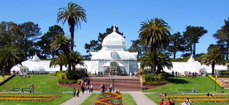
But hey, what about flora and plants, they can be modern too! I bet you my Adobe software that the Conservatory of Flowers, located in San Francisco, was considered a modern building in its own right.
It was constructed in 1878, just as the industrial revolution was taking off. Using metal and glass for a BUILDING? Incredulous at the time. Of course, modern has its own interpreation at any point in time, but that's a whole other blog post.

I digress. Let's get back to the MoMa.


I'm interested in the materials of this exhibit. Here we have concrete, metal, steel, and glass juxtaposed (I think the million dollar word of the era) with wood.....and plants? It is in this contrast that shows the thinking of our age, we are in a state of organic and modern, warm and cold, contrast and compare.

But don't let me wax poetic. I still don't like the garden. Do I have logical reasoning? Maybe not, I just like flowers and foliage.

Give me orchids over concrete any day.

Shout out to all Design-Deprived Nebulas out There


I see some Gestalt theories of balance here....


In the class-that-must-not-be-named, we discussed visual culture in terms of a societal skin. Skin protects us (the individual human organism), it's the organ which we rely on to hold all of our wonderful 30 foot intestinal tracks, our hearts, and our brains, among other things.

Human skin is real. We can touch it, feel it, see it, smell it, even...taste it? All of our human senses form on or from our skin. We each have our own to alter, change, dress, and adorn as forms of embellishment, that is used for functional and protective purposes (hello UV rays!), even for design (henna and tattoos, anyone)? It is with these skins that we establish our individual identity in context of a greater society.

One can argue that we have a visually cultural skin, enabling meaning, language, context, image, and symbol to cross cultures and oceans. It is with this commonality of our visual culture in today's modern times that that we are able to express ourselves to the best of our abilities to others who will recognize these shared meanings.

But what if society (or our definition of society) never existed? Does design exist if society doesn't exist? What about the depths of nebulas and pulsars in outer space? Are their gaseous clouds and various light rays not considered their visual culture? Is this a different kind of design...am I branching on a religious or even scientific concept here?

If a Neanderthal in prehistoric times (who was the only man in a 3000 mile radius) invented the wheel, was it considered design if no one got to experience it except for him?

Here's my main point. If design is something that automatically creates the visual skin/culture that our society grows on, is design by nature community oriented, acting only with the collaborative effort of human interaction?

I wonder if Nebulas can use the pen tool.

Tuesday, October 6, 2009

Typography in Hangul: UC Davis Exhibition


As an intern for the UC Davis Design Museum this quarter, I've experienced a unique opportunity to peer into the behind the scenes of creating, handling, and installing the typographic art of Phill Choo and Hyanju Lee. This has given me a chance to observe the design and content of the exhibit in great detail.

Let's start with the space.

The wall colors are graphic---navy blue and stark white. The blue primarily houses the work of Phil Choo-whose large posters are graphical and bold by nature and minimal in color. The white walls house the work of Hyanju Lee; her bright and colorful pieces pop from the neutral backsplash. The lighting is dim, the emphasis shines on the work softly. The work of both artists is driven by Hangul , the native script of Korea (one that is very popular in pop culture). They manipulate and use letterforms to mimic animals and express metaphors, songs, and even moods that tie to their Korean heritage and culture.

One piece that is particularly intriguing to a “foreigner” observing Korean work is Phil Choo’s “Dream of a Goose”. Here he has strategically transformed the letter forms of Hangul to create the image of, well.... a goose. This effect deepens layers of meaning: the viewer is visualizing the image of the animal *and* reading about the story of the goose that is so engrained into the Korean culture through the words placed in the image. The visual hierarchy of characters (smaller letters in the background) suggests the presence and existence of space. The dark and muted color scheme of images, letters, and words (signs) contrasted with the negative space of the stark white background visually isolates the image, it seems dreamlike and far away from reality. The shapes and varying opacities of the forms give the overall appearance of movement, the goose is flying away.

*image courtesy of Phil Choo