Monday, November 23, 2009

Nathan Shedroff


Nathan Shedroff is a pioneer in the new face of design. In his world (and rightly so), the worlds of business, sustainability, and design all combine together as industries are now becoming more interdisciplinary. He is the chair of the MBA Design Strategy program at CCA.

Shedroff is also considered an expert in the field of “experience design”, which focuses on the total experience of design (not just visual).

This lecture for me was touching on many levels because I think that a lot of designers do not focus on sustainability, or the process that their designs hurt the natural cycles of earth. It’s safe to say that this approach to design focuses less on the aesthetic 2D designs to a more well rounded approach to design THINKING in general. Shedroff really touches on these theories through his presentation by communicating to us in very simple terms.

Overall, I found his lecture to be refreshing because he spoke to us, not in frivolous academic language, but on a basic level. His powerpoint presentation itself was very clean and easy to read and understand. I had the opportunity to speak with him after the lecture and, even on a personal level, he still reaches the same effective communication.


OBJECTIFIED.


I haven’t seen Helvetica yet, but I was incredibly excited that we got to watch this film. I think industrial design is something that only gets lightly mentioned in most of my classes, so it was refreshing to see the theories and practices of some of the most famous working industrial designers today.

I think the main thing that effected was the whole idea of form and function. The way Hustwit communicated to us about the relationship of form and function was simple and thought provoking: if form follows function in the past, what do we have now? A rounded rectangular shape of the IPhone does not visually yield any idea of what it does, however, it probably replaces about 8 or 9 gadgets. This may sound like a simple idea, but I was blown away. Where is form headed to then, will form and function now be two ambiguous and unrelated things?


Simultaneous Contrast

Simultaneous Contrast is only ONE of the many tools designers use to communicate an idea or solution visually. This method of juxtaposing two complementary colors on the color wheel together at the same time brightens both when placed next to or on top of each other…..see image here.


Why does this happen? It’s quite simple. When we see a color and look away, our brain automatically creates an afterimage of the colors complement in your field of vision. So if you stare at a red dot for 30 seconds and look away, your brain will project a green dot, still with me? Because we already have these natural afterimages, when you already place both complements together, their afterimages are strengthened and brightened, causing a SIMULTANEOUS CONTRAST.

I love using this effect not only in my designs, but also for my makeup designs. Here is a picture of my eyes using shades of bright electric on the lower waterline, and a hot red-orange on the lower lash line. By placing these right next to each other and achieving the right intensity of shade, they both enhance the others shade, adding some extra oomph to my eye color.

PENCIL FACTORY 15 USES FOR NEWSPRINT


In the future, will the newspaper be around? The touch of the paper, the black and white ink, it all screams nostalgia. With more and more becoming digital (surprise, surprise), a group of artists and illustrators decided to use the newspaper PAPER as their medium, and create some amazing and whimsical illustration to purchase at a low cost.

What I like about these, is that they play on the newspaper medium, something that typically holds serious information, and contort it to let the medium speak to them, and become their canvas.

The designs themselves are fictional—they don’t try to portray realism, more of surrealism. A lot of the designs’ aesthetic and color palette hark back to the trends of the 70s, a lot of bright and milky tones of greens, blues, and browns.

I wonder when newspapers will run out of circulation….when they do, I’d love to keep one of these around to hang.

DOLCE AND GABBANA HQ


Architecture can mirror human form. With the explosion of blobitecture and the enhanced use of computer generated curvilinear forms, architecture is becoming more sensual, more human, and more stylized. Take for example, the Dolce and Gabbana headquarters in Milan, Italy. While this building doesn’t possess any major “blob” forms, the overall sleek aesthetic and design mirrors its content—a sexy high fashion Italian fashion company.


The use of black, white, metal, and transparent glass gives the building a signature and modern sleekness. Inside, the white walls represent the clean lines and modern aesthetic seen in many buildings today.

Note the dramatic use of lighting in this building as well. Tall spaced louvers, made of opal glass diffuses daylight to give the building a dramatic but feminine softness. Backlighting of staircases and windows enhances the dramatic and sexier display in the evening and night.

Overall, I think that Piuarch did a wonderful job of translating a brand identity into an architectural form that will stand the test of time. The form of the building is modern, feminine, sexy, sleek, and definitely signature.


Thursday, November 5, 2009

moleskin vs. napkin

I bought a Moleskin (tm) sketchbook last week from the bookstore, and let me tell you, I was excited.

Finally, I would have something that great artists used to bring visual genius to life, and a place to pen my innermost thoughts, workings, and ideas.

The next morning I went to my Exhibition Design Studio class.

EVERYONE HAS A (*@%(*@)% Moleskin. How did I not realize this before?!?!

Excuse my francais.

I watched everyone draw loose sketches, write down notes and lists, all with a fine micron ball point pen, and apparently, everyone seems to have my thought process. Buy a fancy $16 notebook and somehow the brilliance MUST come. Oh how I feel herded into the masses. My quest for individuality among the design community has been thwarted yet again! And how silly I feel, duped by incredibly simple yet amazing branding and marketing from the likes of Moleskin.

Moleskin wants you to associate yourself in the same circle as Hemingway and Picasso when you use their notebook. Its quality construction and craftsmanship notions to the past, when craftsmanship and imagination made these puppies bring inspiration to many famous artists and writers. So when you open the cream tinted pages.......you are capable of just about anything.

I'm not trying to dispel that it is a well made notebook; the strappy elastic part that holds the pages in is quite convenient, not to mention the neutral black color makes it match with any outfit.

I know what you're thinking: who cares, it's a NOTEBOOK. Write in whatever you want; your ideas can go anywhere. Napkins, Binder Paper, Manila envelopes (it's been done.)

But if artists sometimes get inspired outside of themselves, what's not to say that the actual medium that you sketch in can be a source of inspiration itself versus being merely a place to put ideas.

The notebook is still sitting on my shelf wrapped in its cellophane. Sometimes I'm just silly. Bah.

Monday, November 2, 2009

Slit Architecture


Trust the Japanese to use concrete and natural light for creative purposes.

Isn't this a breath of fresh air from all the McMansions you see today?

This house was designed by Eastern Design Offices from Kyoto Japan. There are no windows, just slits of light. The exterior is composed of glass and concrete.

The forms of light created from the shape and placement of slits gives this house quite a unique character, almost a solemn holiness.
It's hard for me to form analysis on architecture when I haven't actually walked through the building. The experience of physical presence is one that I cannot mimic digitally.

This style of house reminds me of a famous Japanese arhictect, Tadao Ando, and his style of architecture, see below:


The use of light in architecture can be just as important as the physical materials themselves. In Ando's "Church of Light", the negative space created from the void in the concrete becomes the symbol and light of God, literally. Gestalt is used, even in holy places! Hallelujah.

Back to the Slit House. I'm sensing a form of duality happening within the architecture that balances the overall spatial composition created from the light sources and material used. Even the interior design breathes a warm sigh when contrasted with the "cold" concrete and voids of glass.


The visual rhythm created from the light sources, gives the space depth and a fluidity in motion that is visually pleasing as one walks down the long hall.

The overall mood and tone of the home is quite different than typical "western" style architecture. The architecture seems to respect the Japanese culture....even more general...Eastern thinking and philosophy. It employs principles of architectural balance and combines it with the aesthetic minimalism of its culture. Well done.


Les Infographiques!


I have discovered the art of infographics, and I'm in love.

I love visualizing things, organizing data, and retelling information beautifully. Until recent times, I thought that meant boring grided layouts, 2D charts, etc.....

There is this new burgeoning field of information graphics, and it's VERY trendy right now. But let's not forget our history! Information Graphics has been with us for a long time!! The image above is the Paris Metro System, designed by Harry Beck in 1933, and it's still an example of the blending and representation of information in visual form. Now we just have fancier computers that make everything look better.

Info= Information
Graphics= Images.

The goal is to communicate information in the least amount of words. Visual images communicating language and meaning to you. How very semiotic. Peirce would be so proud *tear*

Some of the computer generated images created are really.....well just look!

This little blurb explains it way better than I ever will:

For 2006, the concept was based on a very old concept of encoding text. As Muller explains: "We assigned a numerical value to every letter of the alphabet. Adding the values of all letters, one gets a number that represents the overall word. (For example, the number 99 would represent the word "poetry")".Using this system, an entire poem could be arranged on a circular path. The diameter of the circle is based on the length of the poem. So the short poems are in the centre of the poster, while the longer ones form the outer circles.

Red rings on the circular path represent a number. As many different words can share the same number ("poetry" shares the 99 with words like "thought" and "letters"), most rings represents different words. The thickness of the ring depends on the amount of words that share the same number.Finally, gray lines connect the words of the poem in their original sequence. So solid lines represent repetitive patterns in the poem.

**************************************************

And here are more images: I'm not going to post their blurbs because it's too much reading, I know you'll get bored. Just enjoy!


And since I love Astronomy...I love this art installation on celestial mechanics (don't ask me to explain it because I can't....)


On an aesthetic note (how could I ever forget to speak aesthetically....it's really in my nature), I love to observe the modern organic forms created in these images. The repetition of form, the colors, the visual space and spatial motion created through these images can truly help to understand them. I mean, what better way to showcase celestial mechanics than to visualize data in space?

I also love that information graphics can have the ability to visualize sensoral data that is not visual in form.....ie smell? sound? touch?

I don't know about any of you but I put on my Itunes visualizer and sometimes ZONE out for half hours at a time.

Hypnotic stuff, really.

Random Scraps of Fabric Stitched together to Create Pattern


Whilst browsing at the Nelson Gallery, I quite enjoyed seeing patterns created by these African American quilters.

Beside getting into the history of African Americans and quilting, on a more FUNDAMENTAL level, I feel like there is a personal satisfaction of actually quilting something together, actually CREATING visual rhythm and patterns. The act of designing with intention: grabbing a scrap of fabric and making it work.

As a non-quilter, I feel like quilters really get that personal satisfaction with themselves.

Anyway, back to the quilts. The visual forms they create are truly hypnotic!

In, Sharecropper's Masterpiece, little scraps create big scraps which create even bigger geometric alternating blocks. The detail on this is purely incredible. And it's all handmade! Imagine the hours of work that went to even one quilt? It's no wonder that quilts have been seen in history and culture as a prized possession that stays within the family, a visual gathering and stitching together of family's history.

I realize that I keep mentioning personal satisfaction with the quilters that created these masterpieces. I can’t really say that I knew or know how people feel as they design and carry out their own process; it seems odd to think that someone wouldn’t enjoy immersing themselves in their craft. The act of quilting is an incredibly daunting task: collecting scraps, deciding which fit your pattern, stitching fabric together. There’s this tactile sensation with touching fabric that is unique from many other mediums. I’m sure, like Pollock or Hoke, that quilters get inspired from the materials (fabric in this case) they use. The options in texture, color, and pattern are varied, and quilters have the creative know how use these design principles to tell stories through their quilting styles. It’s this process which fascinates me. I would love to see a time lapse video of someone hand quilting. How very Andy Goldsworthy, textile style.

Luscious Book Covers


Remember when books were all the rage, when no one knew what Kindle was, let alone online reading? Yes these are now amazing conveniences, but there is something about a well created book that gives me this sensory and visual (and obviously fake) nostalgia, I was after all only born in 1989...scary.


How luscious are these book covers though? Penguin classics commissioned new cloth bound and embroidered book covers for some of their most classic and beloved novels, such as Pride and Prejudice, Great Expectations, Jane Eyre, and MY personal favorite....Dorian Gray.


My favorite design blog, designspongeonline.com, was able to capture an interview with the book cover illustrator and designer, Coralie Bickford-Smith.


I loved reading about her design process for these covers. Her challenge was to create a series of unique covers that represented each individual book but that was still conformed to the general series.


Her solution: create "patterns that all conform to the same grid – it seemed the best way to impose a recognizable style that could work across a series of ten or more books, while allowing the covers to convey something of the character of the individual titles." (Coralie BS).


I love this. The idea of keeping it on a super imposed grid is genius because it unites all the novels when together, but their separate color palettes and motifs give them their own look. It might not be a novel idea (oh me and my puns....) BUT, it's a great design solution; it's clean and modern but still has an edge that give books that old world character, and it definitely fit my aesthetic. Who wouldn’t want to collect them all??!?!! (And a brilliant marketing tool for aesthetes like myself who like pretty things)


Some of the motifs she uses really play on themes and emotions from novels. Dorian Gray, for instance, has motifs of peacocks on a grid. The blatant color contrast between black and white in Dorian Gray also play on the theme of duality in the novel.


It is really interesting to gain insight into the design process of books. A lot of people see novels and actual books as something that will die out eventually to the technological monster. In the long run, it might be the more eco-friendly route.


However, lest not forget the feeling of holding a well crafted novel in your hands, designed immaculately and with intention. Don't you just want to dive into that creativeness?


More eye candy, enjoy!


Monday, October 19, 2009

Touching base on the (form)al aspect of design


I've had a long personal struggle about form vs. function, aesthetics vs. functionality. Which one is better, IS one better? Is surface design superfluous? What constitutes pure design? Those questions are geared for when I've attained more wisdom and experience within the design community.

However, I've recently come across a coffee table that is just too functionally efficient and aesthetically pleasing not to discuss. It's just cool.

Meet the expandable coffee tables from Sculrtures Jeux.

The idea of the expandable table has always been looming within furniture design, as designers and builders aim to create things more suitable for the urban population (who most likely lives in a teeny-tiny overpriced apartment)

Problem: SPACE (or...lack thereof...)

Solution: Stack the space into layers.
*Unique Quirk: These layers have been arranged so you can create the table you want for the environment you seek at the time. Need to eat dinner as well (Asian style seating)? Pull out the layers from the four sides and have four instant places.

Just need an extension to rest your feet on? Done in three seconds, and it still looks sleek as ever.

The part that is the real kicker? This company has thought of many design variations of style and color that still accommodate the main functions of the furniture piece. From elegantly stained pieces to wild and lacquered, they have reached to many aesthetic tastes all in hope of selling their product. While all may not enjoy the purely geometric forms of the table, it is clear that they have made stylistic differences within a modern schema.

That's just good design and strategy.

And some more eye candy...


Vivels: Package Design

While perusing my favorite package design blog, thedieline.com, I came across a great mockup of packaging for a Bakery in Stockholm that, unfortunately, was never used.

There are many tenets of this design that speak to me critically and aesthetically. Overall, I enjoy the minimalist use of space and color combined with the simple graphic of wheat on the bottom of the baguette package. It gives the graphic a sense of true space from earth to sky (it seems Vivel is written in the sky). The graphic of the wheat itself is whimsical and illustrative in nature, giving a charming homage to the old style of Scandinavian baking.

The typography of the packaging can only be described as "retro", again going back to the old style baking of the mid century. It's a nice cultural and typographical reference that retains its modernity within this composition. The letterforms are bolded and very black indeed, main font for Vivels has its own unique character and stands out against the block letterform of the body text. The contrast of thick and thin in the numbering, however, softens the overall composition and works to, in fact, remind us that this company is selling baked goods...not guns.

The cellophane packaging below is an interesting packaging material choice, but it really lets the product speak for itsself while still "wrapping". The scalloped edges on the black borders give the product finesse and feminity, while the black masculine colors and typefaces balance the overall design.

The general design of this packaging, I believe, does a good job of balancing feminine and masculine without getting "Suzy Homemaker" on the bakery. The interesting typographical treatments throw us for a loop because they are more bold and intense than a typical bakery package design, which is usually assumed to more refined and feminine.

It's a simple but beautiful Scandanavian design. I'd eat it.


Wednesday, October 14, 2009

The Importance of Networking

Sometimes it's really hard to get out of one's shell. You sit in the dark, on your computer trying to craft perfection in Adobe somethingorother. You get so caught up in details that you forgot about what design is really all about.

It's about community.

When I took 4 design studio classes this summer, I only kept my sanity by discsussing projects with fellow classmates, consulting on them for ideas, and collaborating on projects. It also saved me a few self inflicted all nighters.

In this growingly competitively field, a lot of people suddenly lose track on the benefits of collaboration, and the true reason why we practice design: to reach out to people. Otherwise, wouldn't it just be selfish "art"? But that's a whole other story.

I'm so greatful for organizations like AIGA that enable networking and collaboration to happen.

Creativity can be a beautiful and personal experience, but for the most part, it's about reaching out and exploring new ideas with different people. CO-Lab-oration!

Finding Creativity in Unexpected Places

It's really hard to judge how designers and artistic people find their creativity. Is it something intuitive, innately theres, something that...if it's there it's there?

There's been lots of discussion on where creativity comes from, inside or outside the brain, nature or nurture. It all depends on many factors.

I want to talk about the story of one of my favorite graphic designers and typographers: Marian Bantjes.

After being a book typesetter in her 20's, and owning a design studio in her 30's, Marian was burnt out by age 40 and unhappy with what she was doing with her job. So she just quit.
And moved to an island of the coast of Vancouver, Canada by herself.

She began to create the most beautiful and personal works of design and typography. Her creativity began flowing, and her mind created these beautiful pieces of art. They truly were art
A year and a half after she literally, overnight, exploded onto the design world and got noticed for her work.

Academically speaking, to what degree does frustration push us to the edge of our creative selves? How long does it take until we just can't do what we're doing anymore? Did it take Marian 20 years to realize what she truly wanted to do, and if that's the case, were those 20's years of "suffering" needed to get to where she is now?

I also wonder (and I'm assuming it does), how much her personal lifestyle and location play a huge factor in the continual renewing and exploring of her creativity. Probably a lot. Who wouldn't want to live on a quiet private island, for a little while anyway. Enjoy some of Marian's exquisitely crafted worked:


Tuesday, October 13, 2009

Typography in Hangul: Exhibit Critique

I've established that I intern four hours a a week at the Design Museum here in our own Walker Hall. So for four hours a week, I get to observe the workings of an open museum exhibit.

I really do love this particular exhibit, typography. It's a personal interest of mine, so it's nice to see designers that have truly enhanced it to art level form.

The letters interpreted are Hangul, a native Korean script, so without reading a description, it's a lot harder for me to decipher the meaning than if it were say....in English lettering.

A part of me, however, enjoys this unknowing.

When I first look at these works, I am first seeing shapes, opacities, and layers; not meaning. It is through the reading of the description and the exploration of the composition as a whole that I begin to interpret for myself see meaning. It's like looking at a translation book and going "ahhhh I understand now”.

But let’s go back to the letters themselves. Typography in general is an icon that has specific meaning. Its meaning can be infused into language- that’s what makes it so interesting! It is both visually and auditor-ily used. You see, say it, hear it, and hopefully, understand it.

I don’t like really quite where I’m going with this in terms of society. I do think, however, that there is a greater emphasis being placed on the manipulation of type and a growing exploration of typography in general- and I like it.

Wednesday, October 7, 2009

SF Moma Garden: Where is the garden?

I had a chance to explore the San Francisco MoMa's recently opened rooftop garden, an urban landscape tucked away in the depths of busy downtown area.

One little detail, where is the GARDEN!?
I know, I know Victoria, It's a modern museum. The curators and designers took this in a more sculptural direction.

The space itsself balances the juxaposition of modern concrete and metal with the organic forms of nature (seen in the botany and wooden benches). It's as if this was designed to say "almost there, but not quite". Hey, that's how the Greeks thought of design! Did the designers purposely create voids to symbolize the voids in our culture or even to reference the Deconstructivist architects and artists of our age? That's up to the viewers perspective.

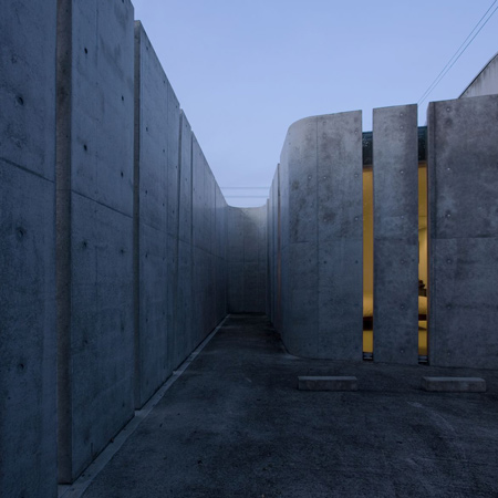
In this exhibit, one walks in through a long windowed hall to see a glass, concrete and metal structure. Across the way is a suave barista serving only the finest gourmet coffee (appropriate for San Francisco's foodie culture). However, the first thing one sees is modern metal *matroyshka* spiders! (The russian word for the Russian toy dolls, when you open one there is a smaller one inside, and so on....) A very abstract, and dare I say modern again... MODERN interpretation of the natural creatures that would be in this space.


As you walk to the right you see a vast layout of abstract sculptures with a few earthen accents thrown in for good measure. The sculpture garden seems designed more as references and symbols of our time. We see the spider, but it's overscale, metal, not alive! We see a lone tree in a plant box, but no foliage growing organically from it. Where has the life gone?


But hey, what about flora and plants, they can be modern too! I bet you my Adobe software that the Conservatory of Flowers, located in San Francisco, was considered a modern building in its own right.
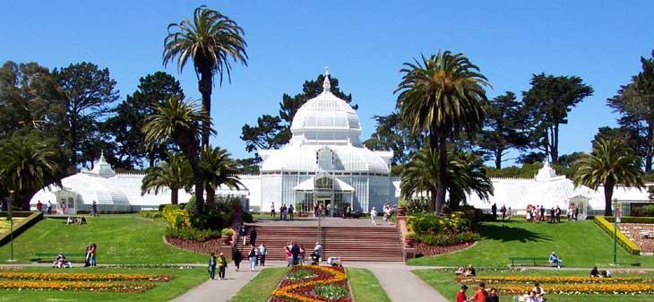
It was constructed in 1878, just as the industrial revolution was taking off. Using metal and glass for a BUILDING? Incredulous at the time. Of course, modern has its own interpreation at any point in time, but that's a whole other blog post.

I digress. Let's get back to the MoMa.


I'm interested in the materials of this exhibit. Here we have concrete, metal, steel, and glass juxtaposed (I think the million dollar word of the era) with wood.....and plants? It is in this contrast that shows the thinking of our age, we are in a state of organic and modern, warm and cold, contrast and compare.

But don't let me wax poetic. I still don't like the garden. Do I have logical reasoning? Maybe not, I just like flowers and foliage.

Give me orchids over concrete any day.